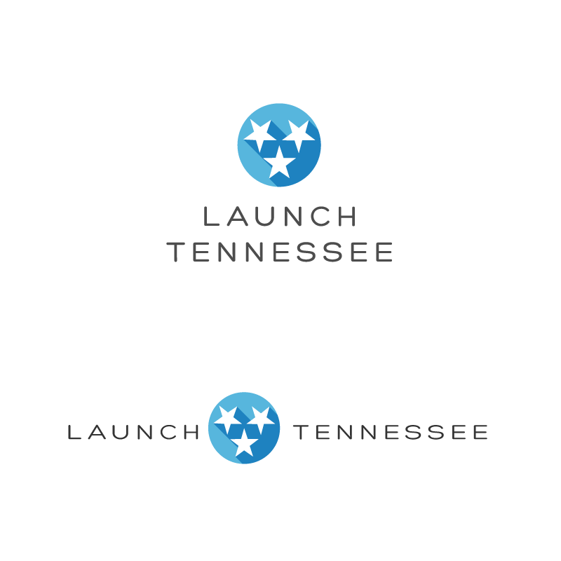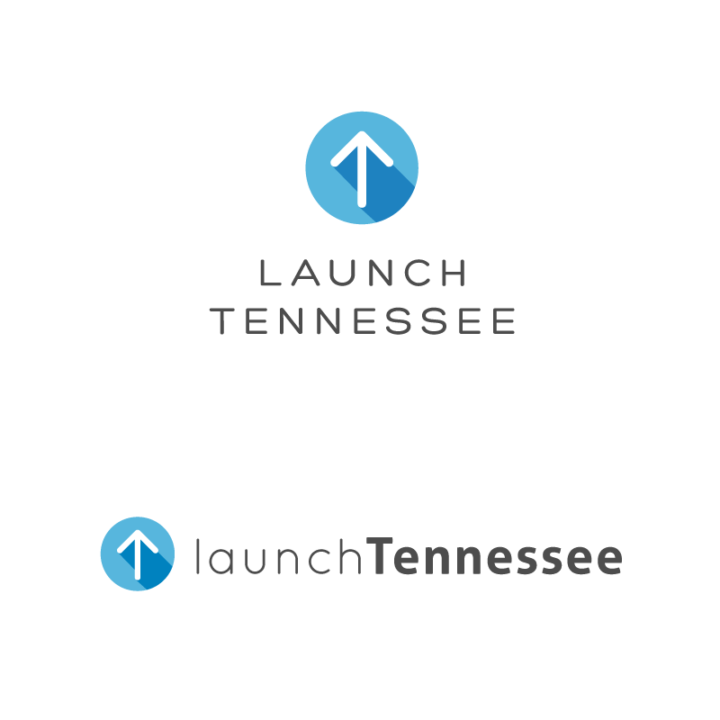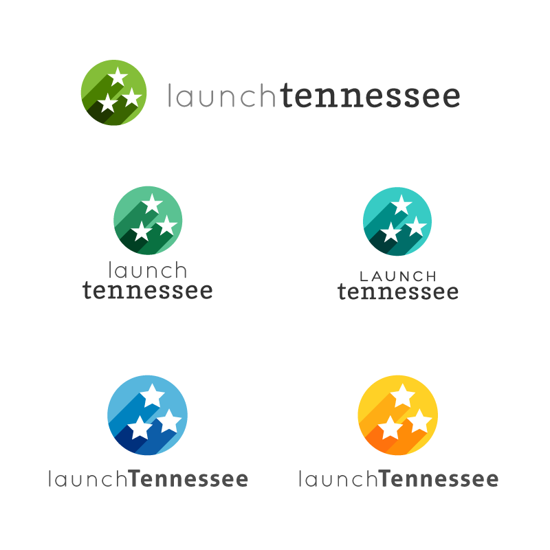
Logo design for a public-private partnership focused on supporting the development of high-growth companies in the State of Tennessee with the ultimate goal of fostering job creation and economic growth. LaunchTN focuses on four key areas: entrepreneurship, commercialization, capital and outreach. LaunchTN is in part funded by a grant from the State of Tennessee. They wanted to freshen up their current logo and were open to a new color scheme but wanted to distance themselves from too many bright colors. Their main audiences are entrepreneurs, startups, investors, inventors, technology-focused, media, etc. Played with concepts that use an upward arrow to illustrate launching and growth, and the star element from the Tennessee flag. The liked the flat design style and when I added the shadows to the stars I made sure to make them look like they where launching as well. Tried to keep the design and the type clean and simple to give it a professional feel acceptable for a governmental agency. Though I didn't design the website you can see the logo in action here.